
SALUS
Brand Strategy
Social Media Strategy & Content
Visual Identity
Logo Design
Art Direction
Illustration
Social Media Strategy & Content
Visual Identity
Logo Design
Art Direction
Illustration
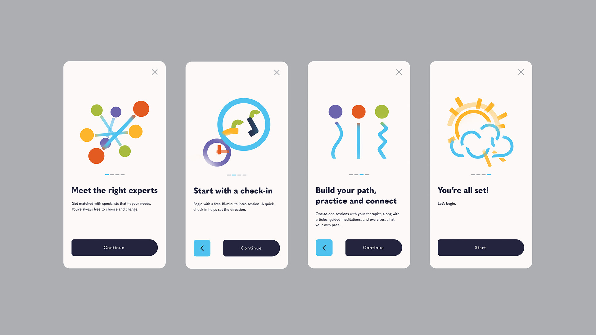
Salus is a personalized, preventive digital health platform built to support people before things break. Inspired by the Roman goddess of health and continuity, the brand approaches care not as crisis management, but as an ongoing state of balance. This project was not about designing an app interface. It was about designing a system of care that exists across screens, spaces and everyday moments.
From identity to social, digital to physical, everything is governed by one principle: Care should feel structured but never confined.
One line holds the system together.
Variation keeps it alive.
Balance keeps it human.
From identity to social, digital to physical, everything is governed by one principle: Care should feel structured but never confined.
One line holds the system together.
Variation keeps it alive.
Balance keeps it human.
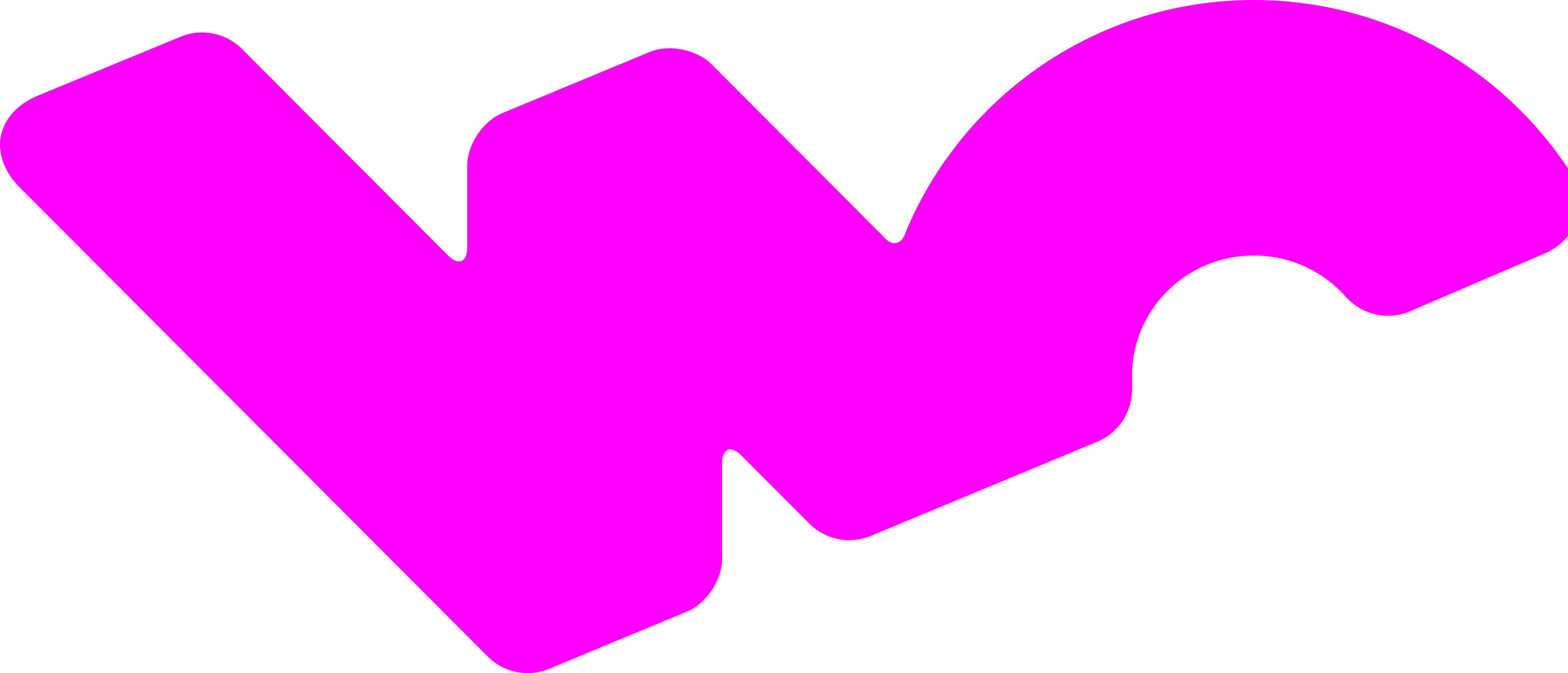
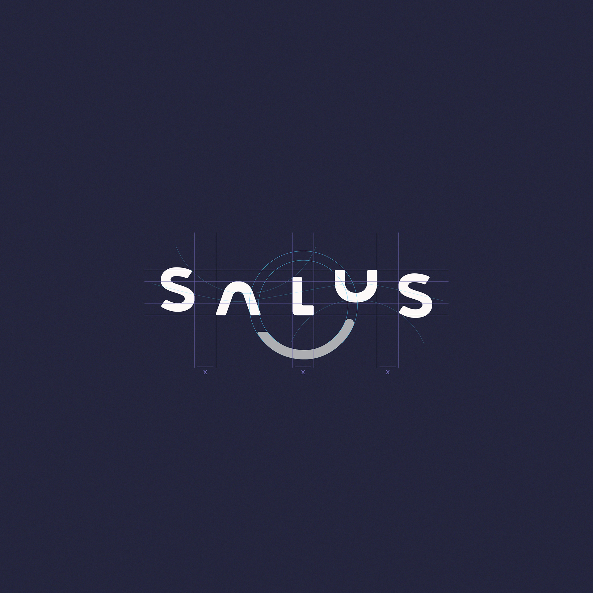
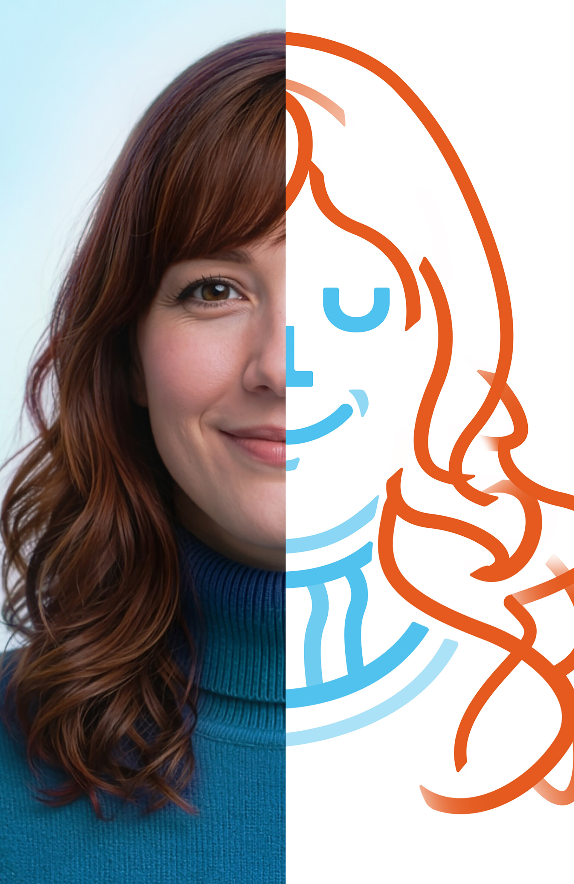
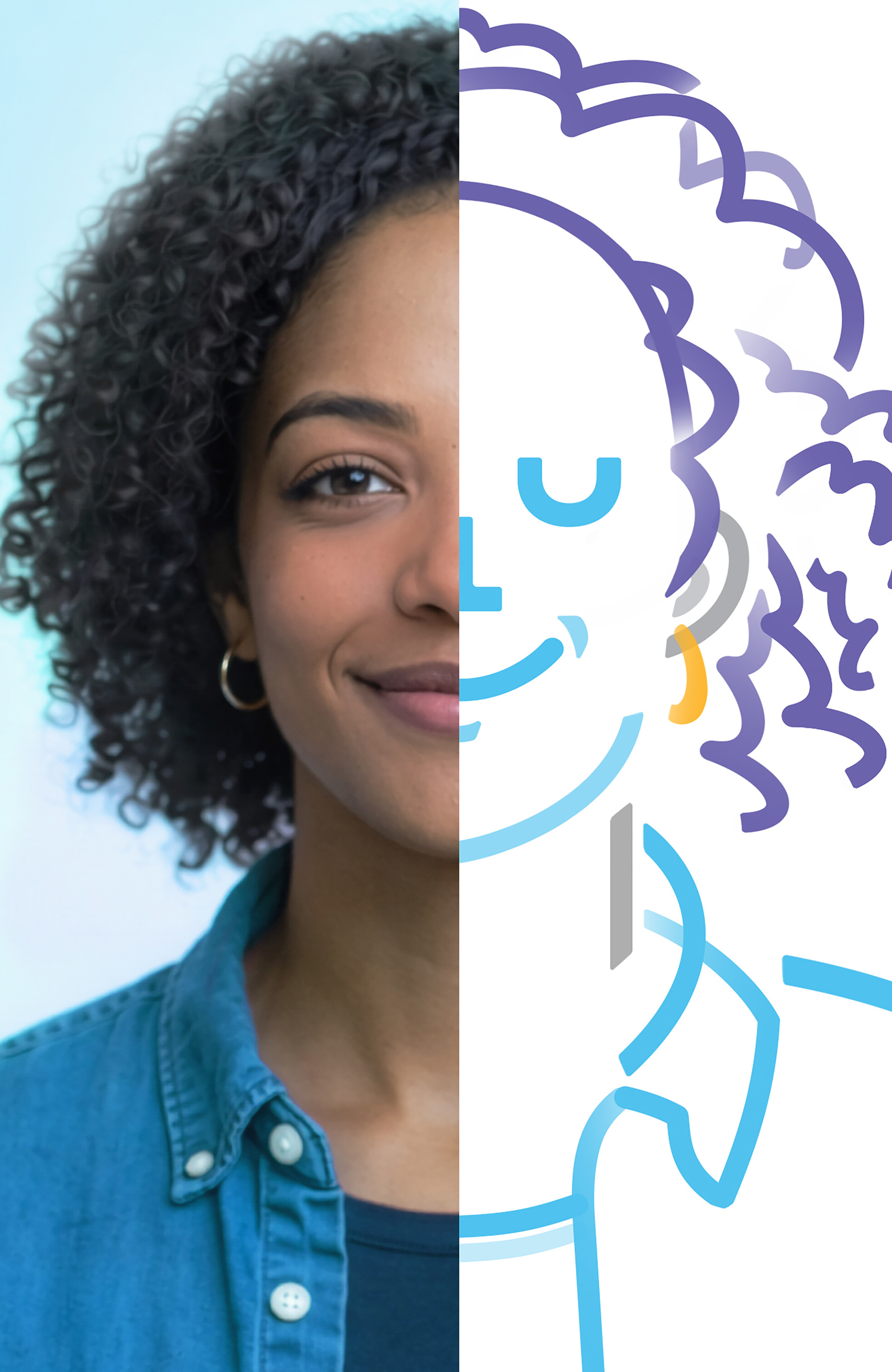
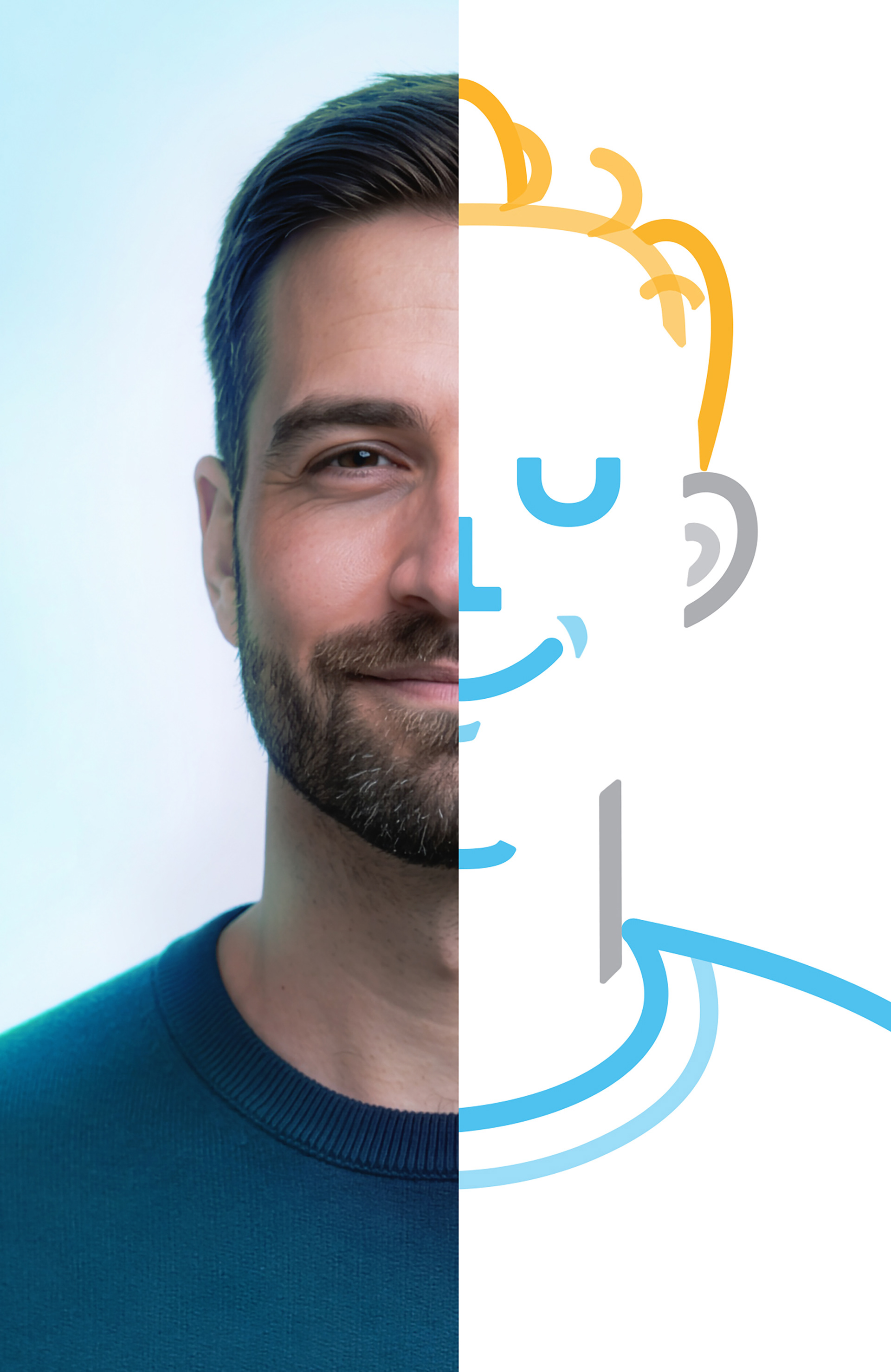
Where the line begins
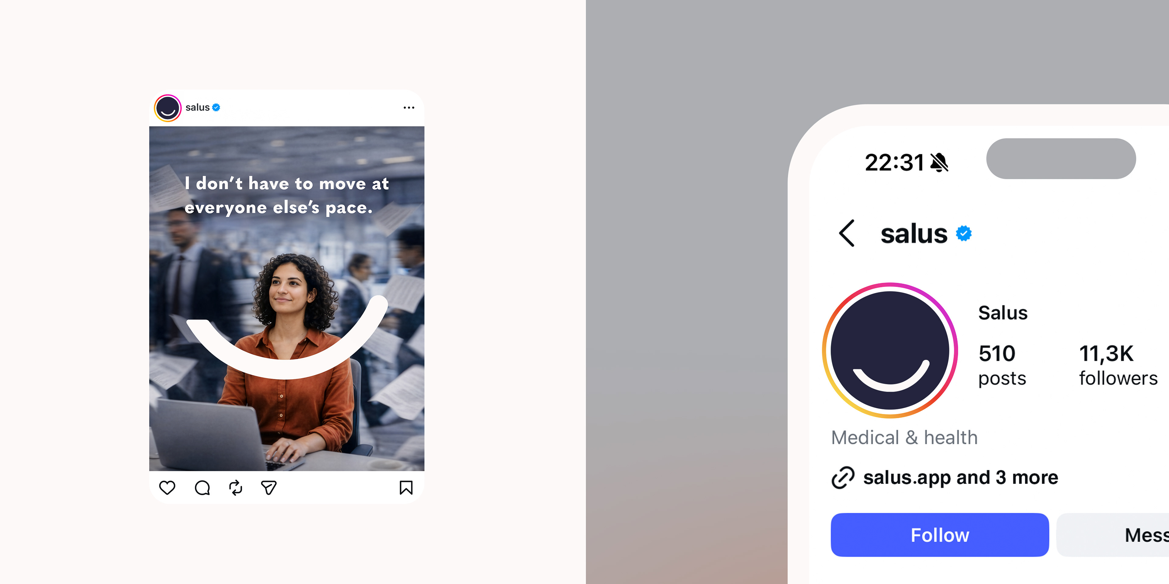
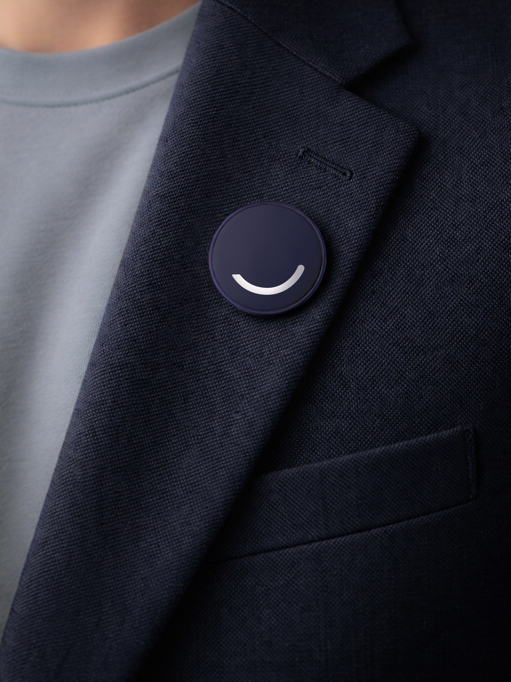
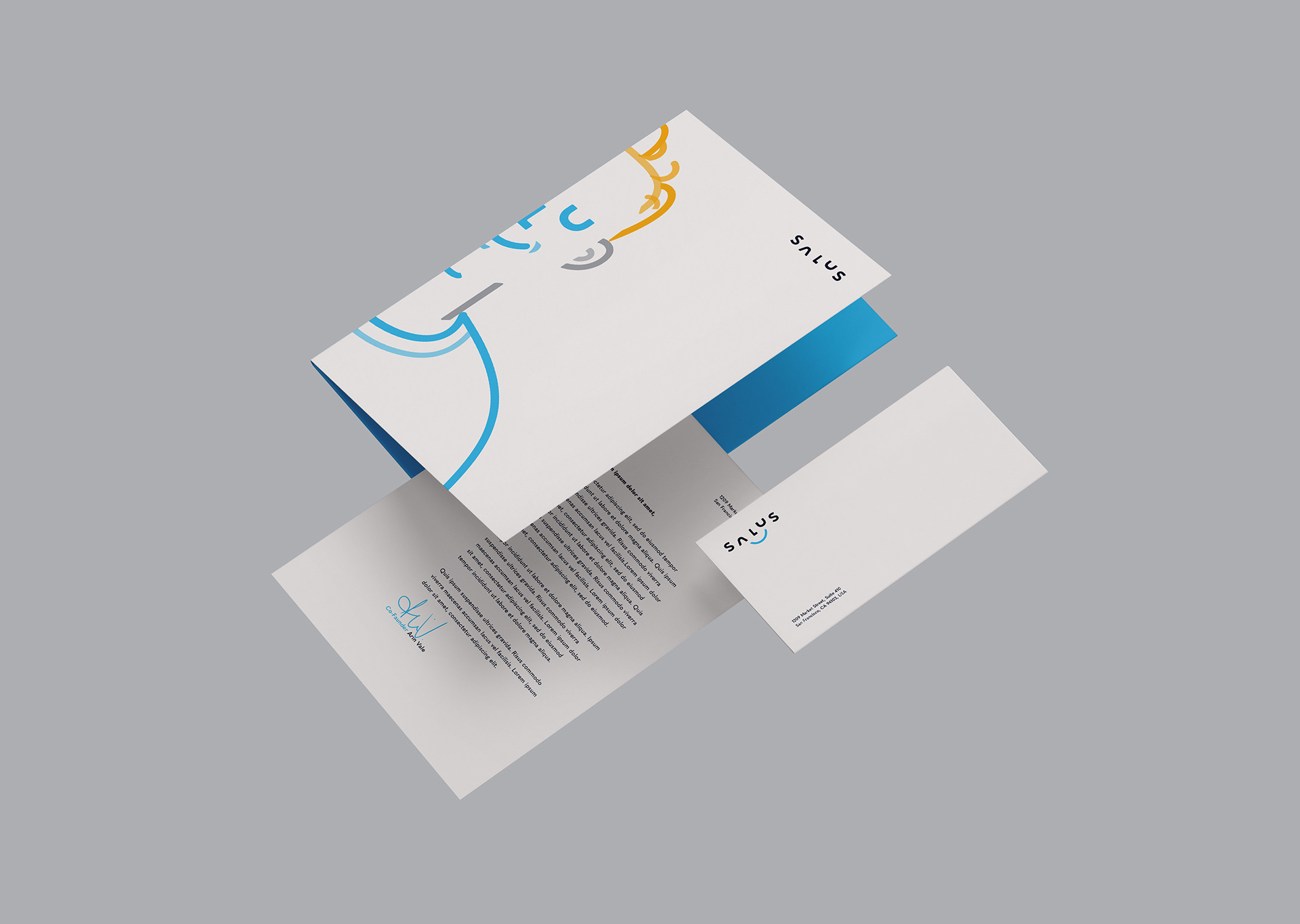
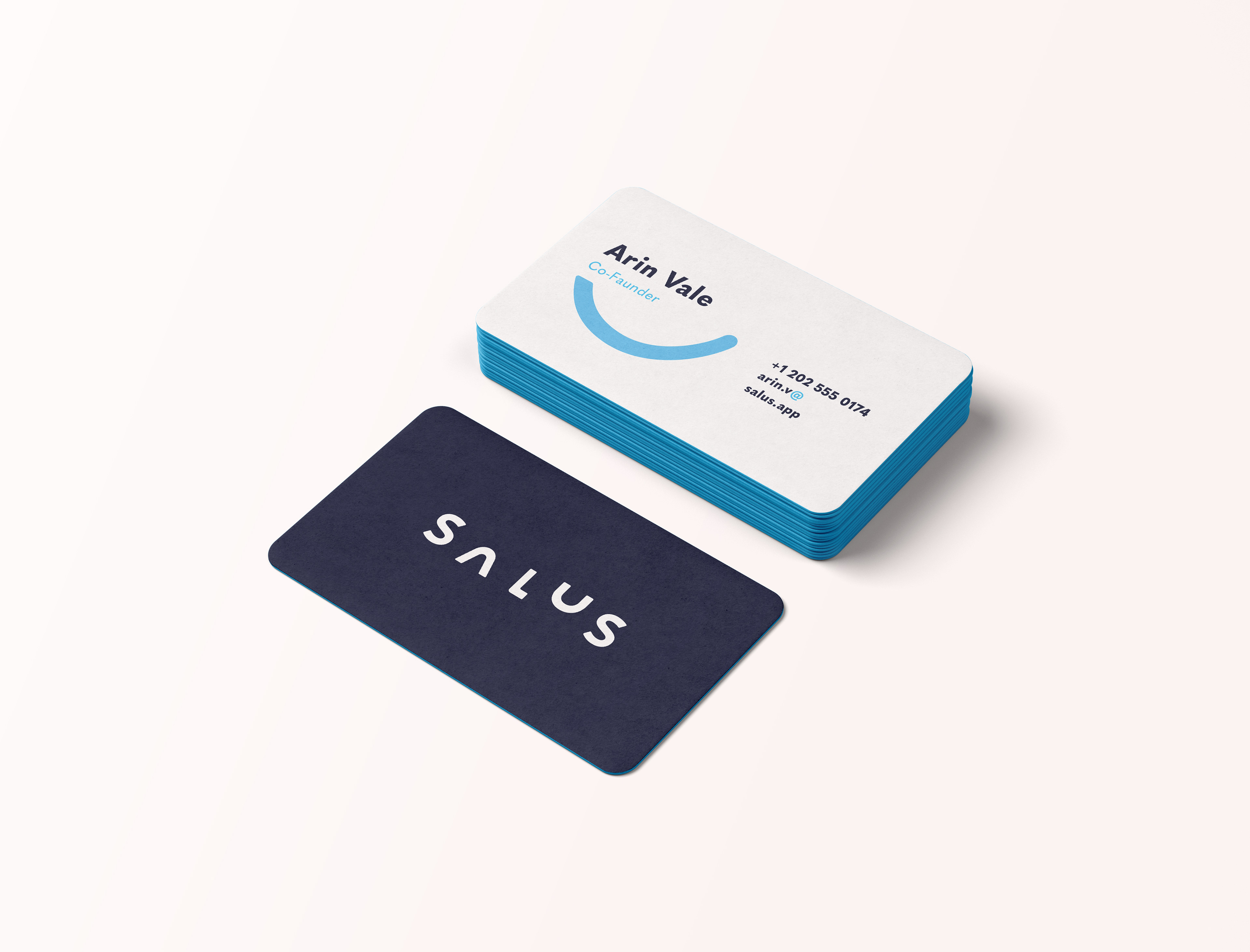
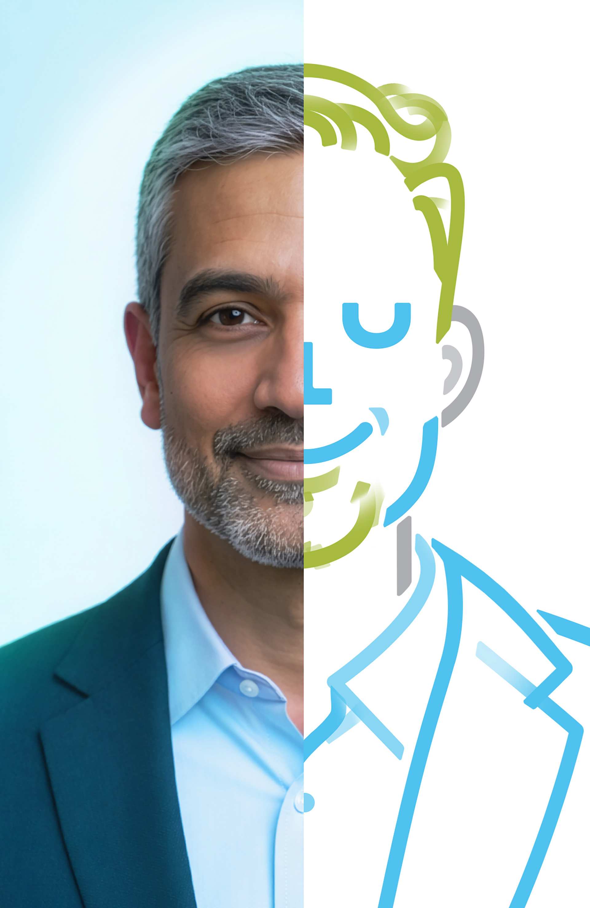
The identity begins with a single line, not as decoration but as structure. A controlled gesture that becomes the smile, the smallest possible symbol of reassurance. The logotype was drawn from scratch, independent of any typeface, allowing precise control over rhythm, weight and proportion. Built on geometric logic, the logo intentionally resists strict grid confinement. It steps slightly outside alignment as a deliberate decision. Care is not linear, and emotional states are not symmetrical. The system reflects that tension between precision and release. Control without rigidity defines the foundation.
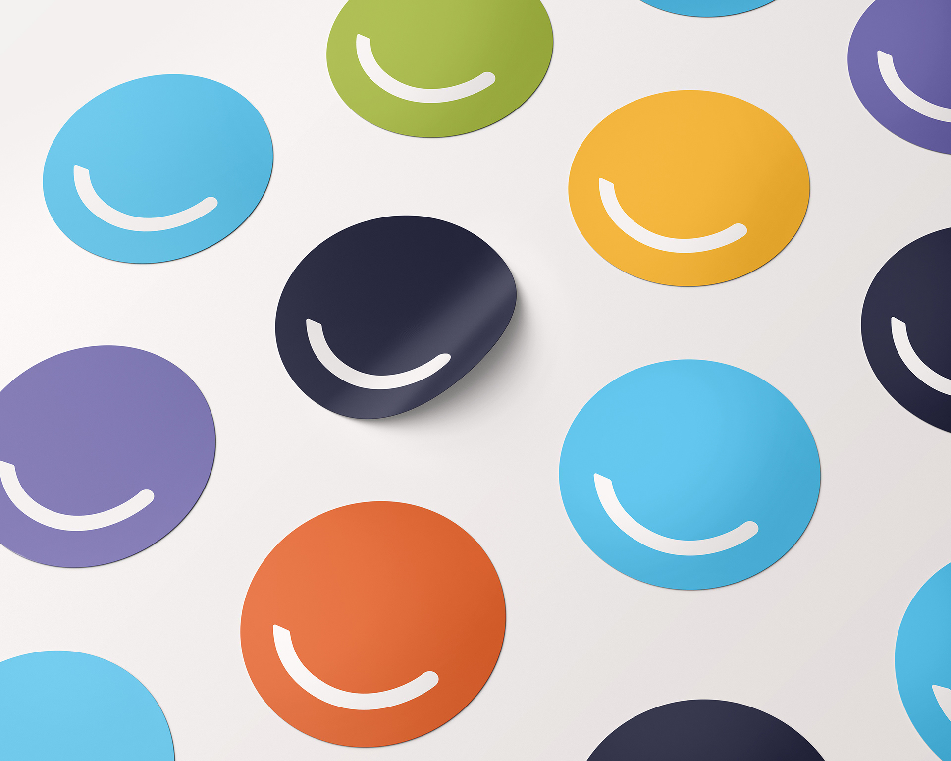
Color as emotional architecture
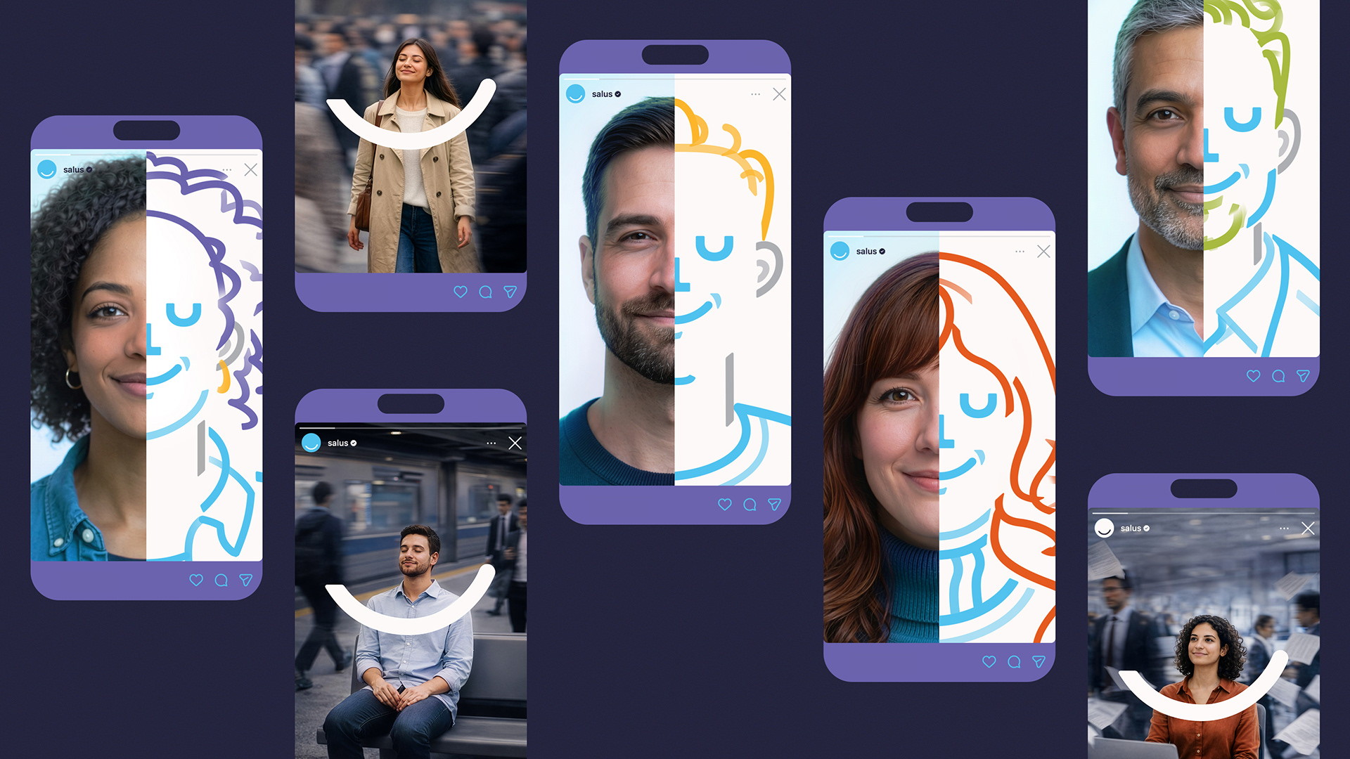
Blue anchors the identity. It is calm, steady and grounding. It establishes trust and psychological safety. Calm does not mean muted. Saturated secondary tones introduce energy and individuality. Color operates as contrast rather than decoration, suggesting multiplicity within a unified structure. The brand holds contrast without losing coherence.
Repetition with variation
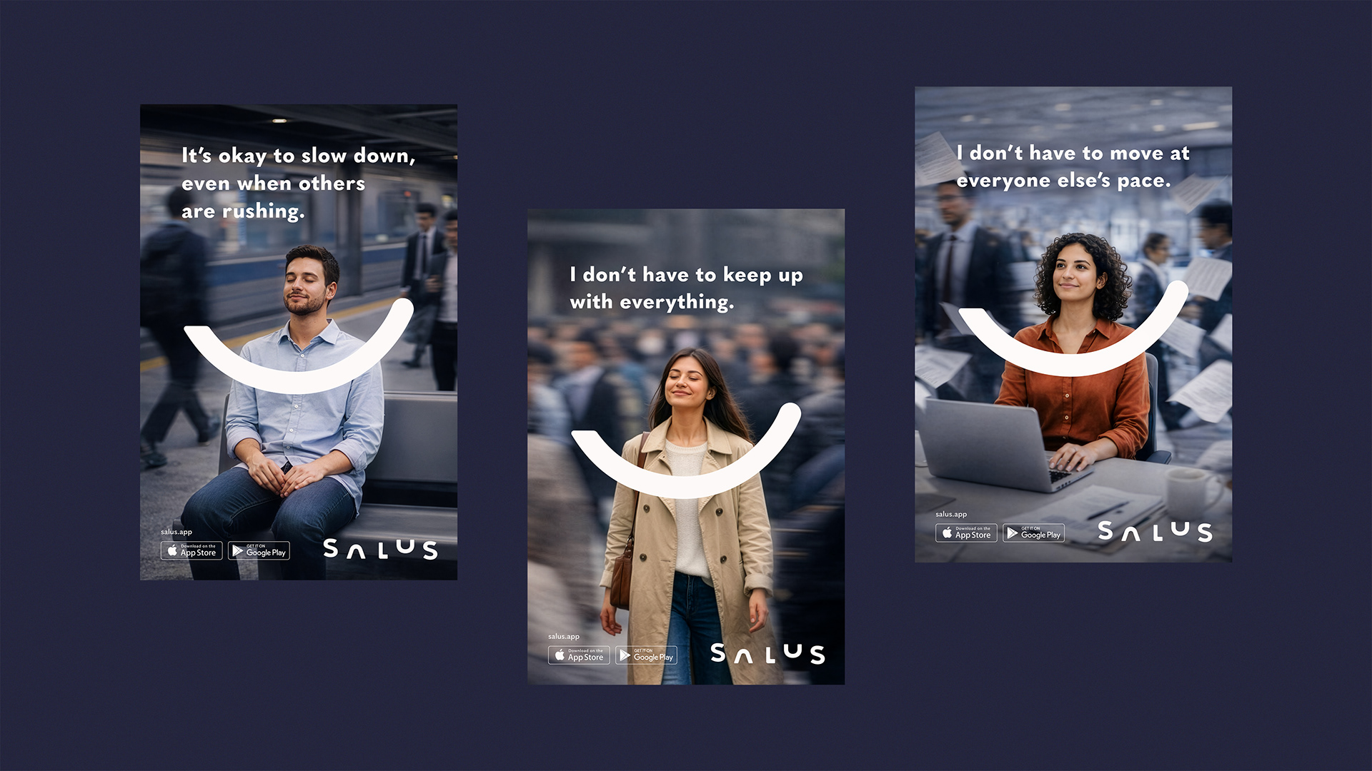
Through repetition with variation, the line evolves into a modular language that expands across icons, illustrations and spatial compositions. The system remains coherent without feeling mechanical.
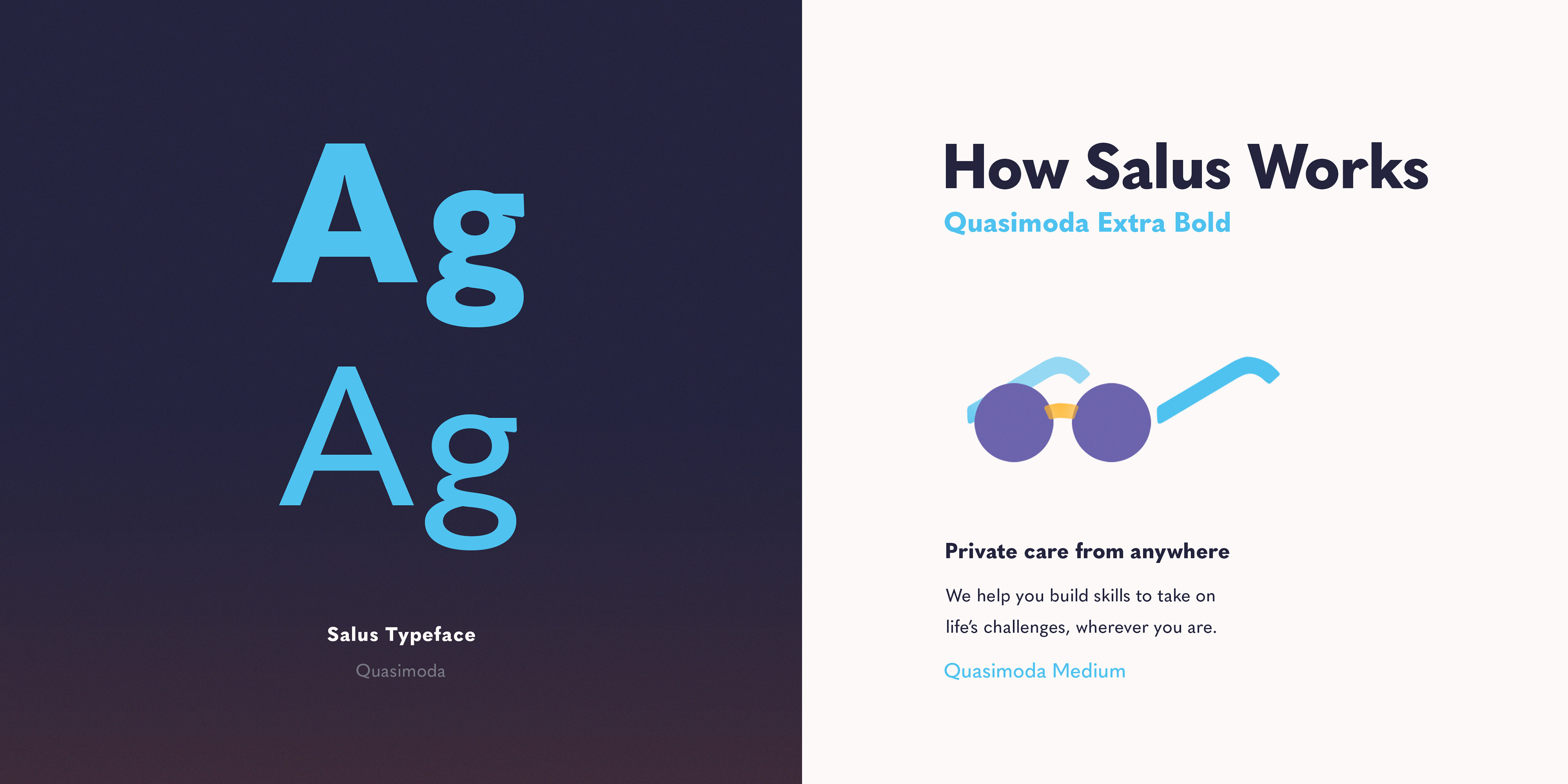
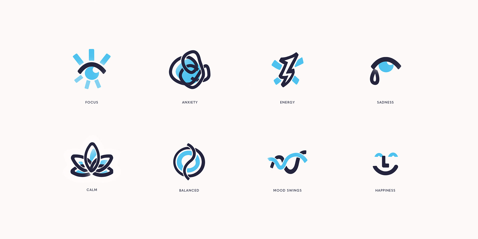
Structure without rigidity
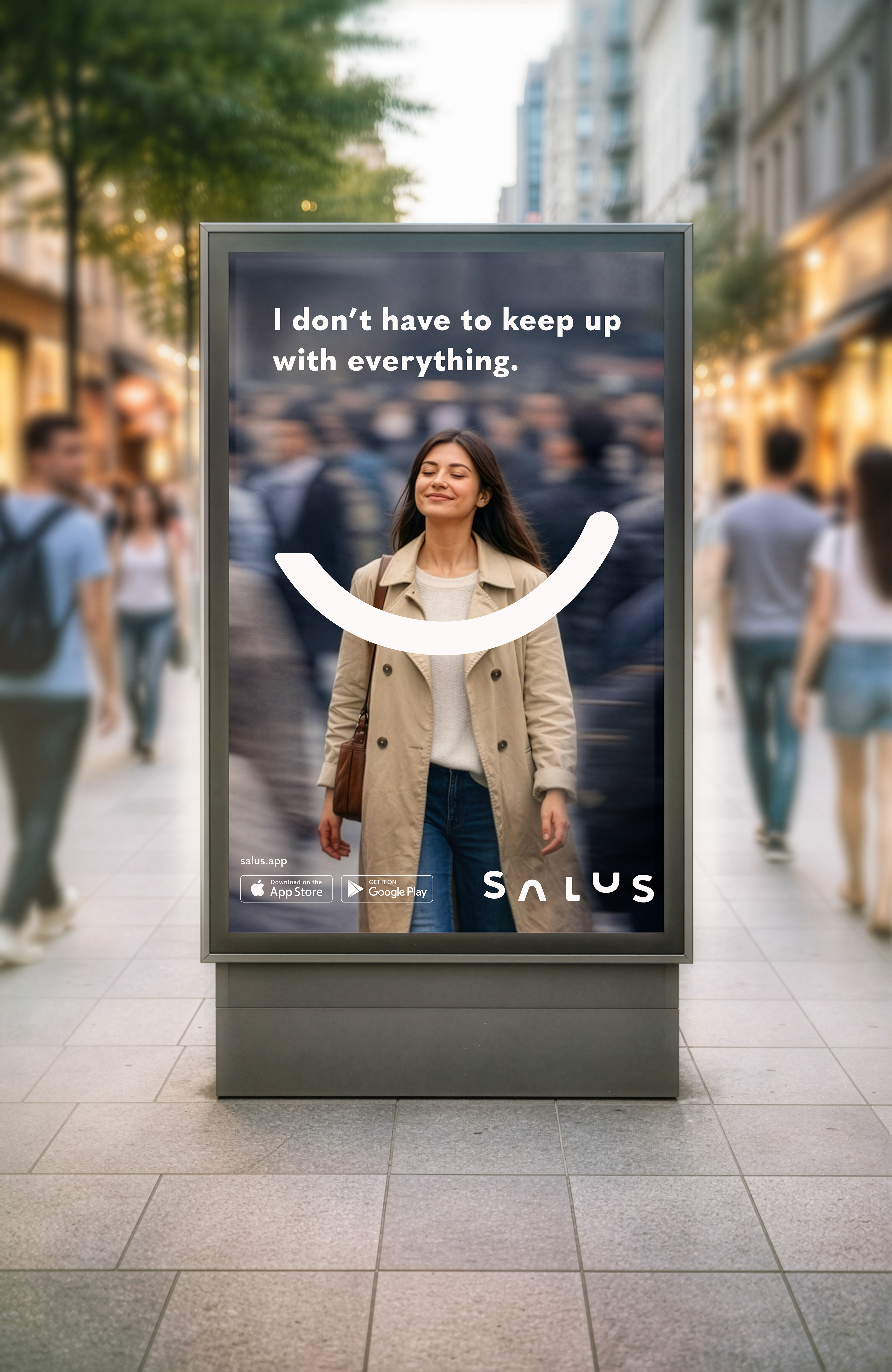
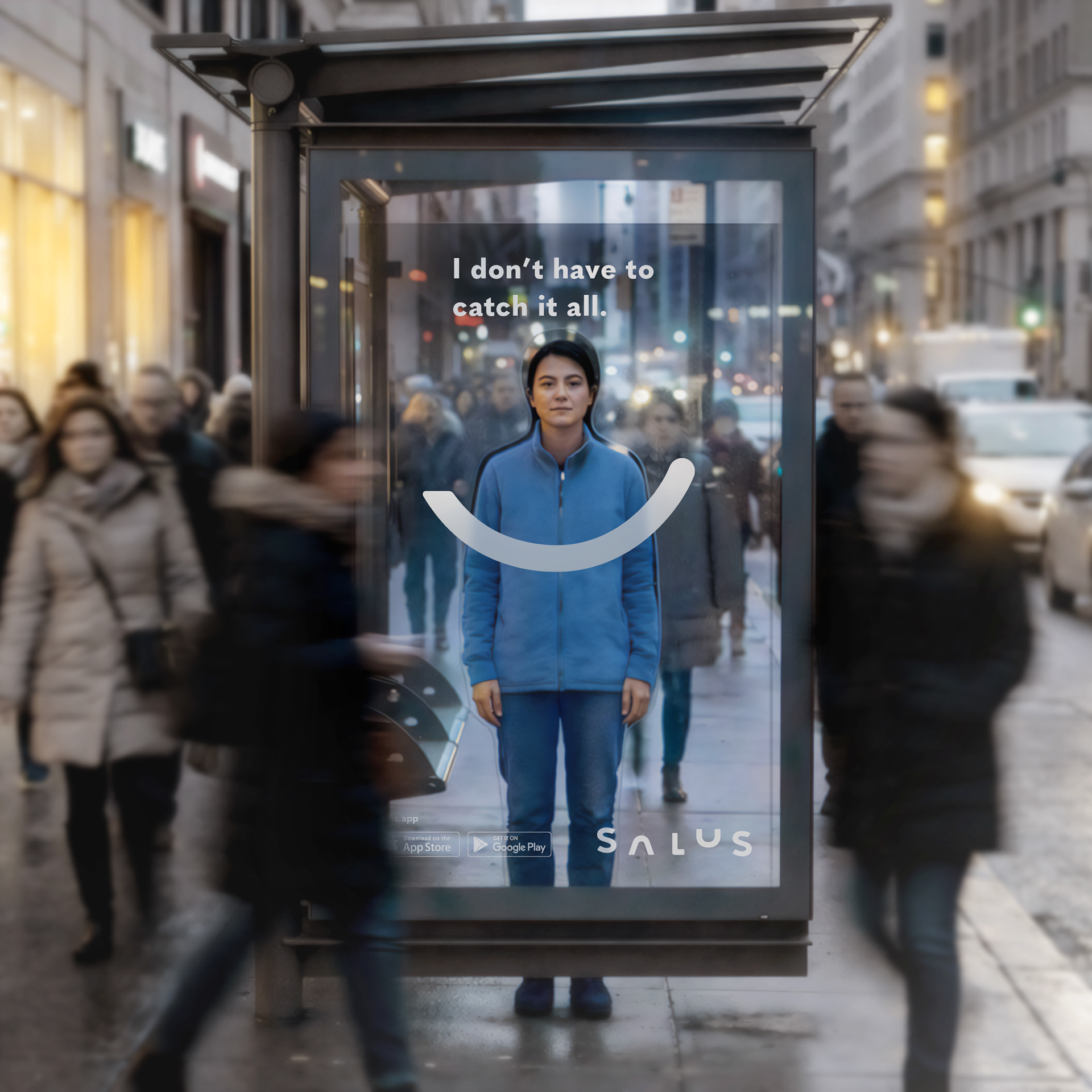
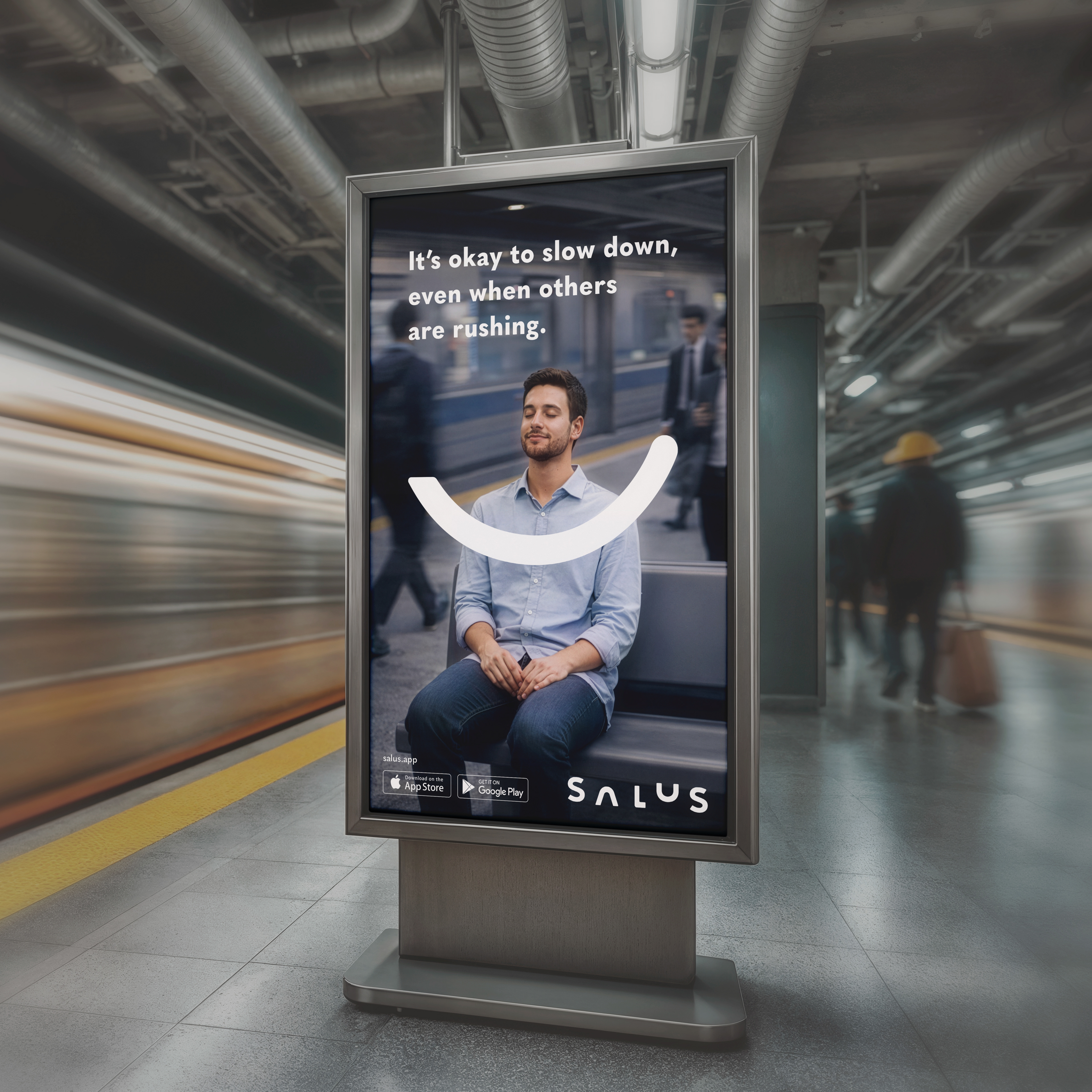
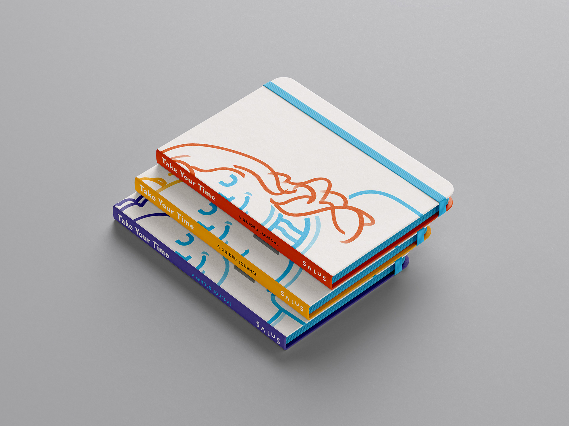
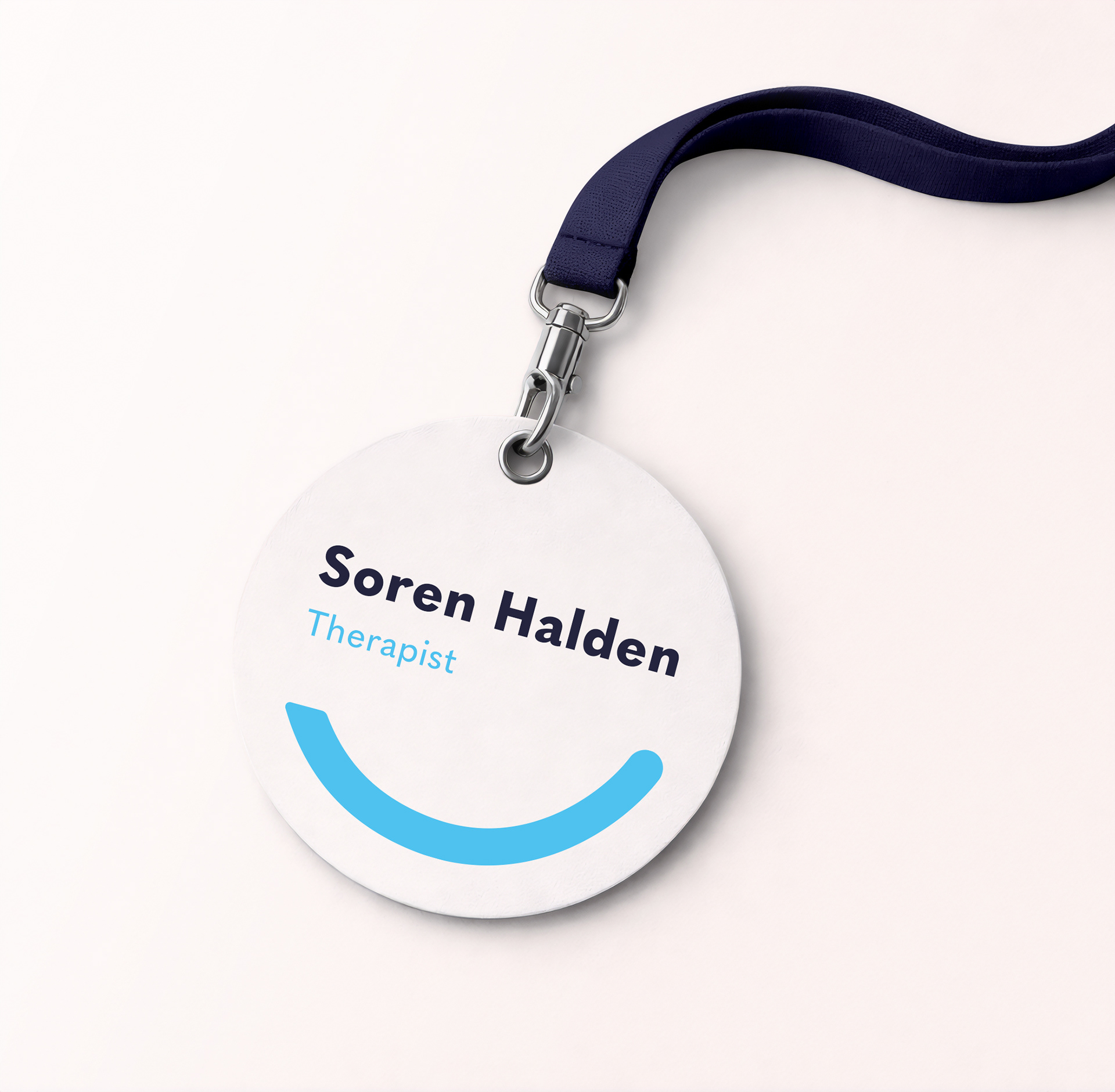
At its core lies a simple question: how can a health brand feel structured without feeling rigid? Across mediums, clarity and warmth coexist. A single linear logic runs through the system, allowing information to remain clear without becoming overwhelming. The smile stays recognizable at small scale and from a distance, enabling the identity to function seamlessly across social media, print and OOH applications. Physical touchpoints were treated not as merchandise, but as quiet extensions of care, objects that naturally belong to the healing process.
The visual logic is disciplined yet flexible. Structured enough to hold together, flexible enough to breathe. This balance ensures the identity feels reassuring without becoming clinical.